Case Study
Rebuilding an Enterprise Design System After Team Attrition
The design system had barely moved for more than a year. I led its recovery through client-informed design decisions and a shared delivery path with framework, theme, and Storybook developers. Enterprise Design System (EDS) 1.2 was formally released on August 28, 2026. As of October 4, 16 of the 22 product teams or pods in the design system's reach use that release. More than 200 developers, requirements engineers, and quality engineers work with the system.
EDS 1.2 adoption
16 / 22
Product teams or pods using the release as of October 4
200+
Developers, requirements engineers, and quality engineers
96
Released component and pattern guidelines
177
Code Connect mappings in the July 15, 2026 snapshot
597
Component variants examined in the broader contrast audit
Outcome and decision
We moved a stalled library into a released design and coded reference, then changed how teams plan, implement, and verify adoption.
The dedicated UI designer had left, and the inherited library was still mostly a partial set of restyled Material UI components. Product teams had deadlines regardless. More components alone would still have left teams guessing how they should behave in a real screen. I treated the recovery as a design and delivery problem: define the behavior, build it, explain it, release it, and help teams use it. As design system owner, I set design priorities and migration guidance, worked through tradeoffs with the application framework, theme, and Storybook developers, and brought release timing into application planning. The developers owned production code; product teams owned their migration and application checks.
Design work
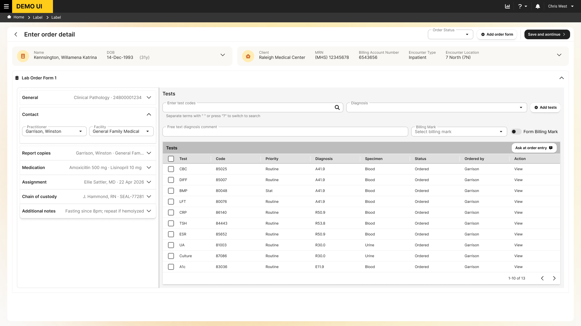
One product screen drew on the whole system
A detailed Order Entry exploration applies EDS decisions across a page shell, navigation, patient context, form fields, actions, and a populated test table. The image uses generic branding and mock rows, making the system breadth visible in one screen. This is a design example of how shared decisions could come together in a real workflow, not a claim that this exact screen shipped or improved task performance.
Teams could copy a screen faster than they could use the system
A screenshot could show one state of a component. It could not tell a developer what should happen at a smaller viewport, on keyboard focus, or when an error appears. Without shared guidance, product teams could end up making those decisions locally under deadline pressure. Each local choice risked making the next theme change or accessibility correction harder.
I inherited the system alongside product work and with limited UX support. We could not replace everything at once, so I audited the library and roadmap and organized the first roughly four months into a sequence of releases. The roadmap listed 176 component sets and 836 variants. Those numbers show what we had to assess; they are not a count of completed rebuilds.
EDS 1.0 was also difficult to use in an agent-assisted workflow. Visual components alone did not give an agent a dependable account of token names, state behavior, keyboard rules, or coded properties. Making the system AI-ready became an explicit goal for EDS 1.1: structure the guidance and produce machine-readable token and component mappings that developers and their workspace agents could use. EDS 1.2 expanded that coverage and tied it to the coded library and release process.
Client evidence changed the density of the system
Client interviews and testing, reinforced by stakeholder feedback, showed that the amount of information visible at once mattered in these workflows. We did not solve that by shrinking every control. We changed shared rules where density served the work, while keeping room for states and labels where clarity required it.
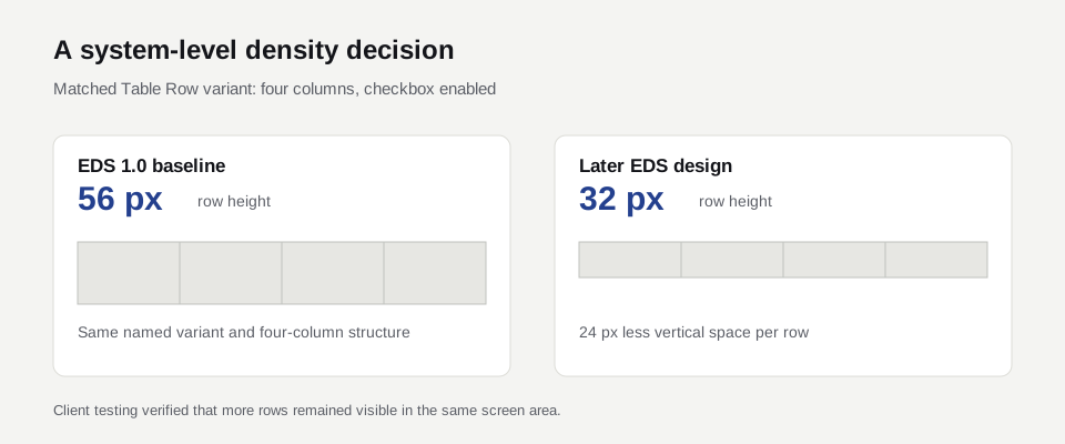
A matched design example makes the tradeoff visible: a four-column Table Row moved from 56 pixels in the EDS 1.0 baseline to 32 pixels in the later EDS design. Most modified typography styles also became smaller or tighter, while two intermediate spacing values gave teams finer choices. Text Field height moved the other way as its states and label treatment evolved. These decisions belonged in the system so product teams would not each improvise their own density.
| Measure | EDS 1.0 | Later audited design | What changed |
|---|---|---|---|
| Matched Table Row height | 56 px | 32 px | Less vertical space per row in the design specification |
| Failing contrast pairs | 23 of 40 checked | 6 of the same 40 at EDS 1.1 | 17 fewer failing pairs in this matched audit |
| Typography | Baseline scale | 10 of 14 styles changed by EDS 1.1 | Each changed style became smaller or tighter |
| Spacing scale | Existing steps | Two intermediate steps added | Finer choices without removing larger spacing options |
The row dimension was checked against the EDS 1.0 and later design files, and its greater on-screen capacity was verified in client testing. The contrast, typography, and spacing comparisons come from the 1.0-to-1.1 audit. These measures have different release points; none is a measure of delivery cycle time or product defects.
Three decisions made the recovery possible
-
Tell teams what each change would require
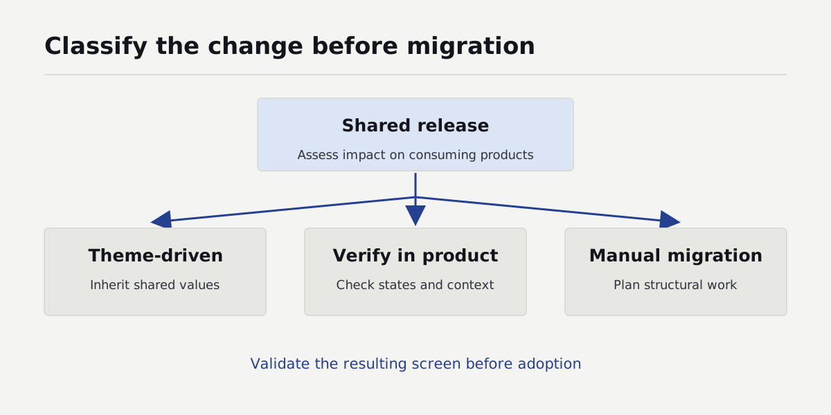
I sorted changes into three practical groups: updates the theme could carry, updates a product team had to verify, and changes that required manual implementation. A palette or typography correction might travel through the theme. A new component state still needed to be checked in an application. A structural pattern change required product work. This gave teams a way to plan a release against their own deadlines.
-
Make the design and coded behavior agree
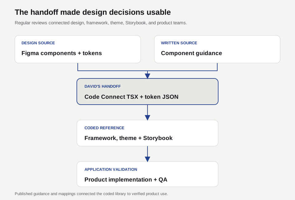
I worked regularly with the application framework UI developers, theme implementers, and dedicated Storybook UI developer to keep the design and coded library coherent. I also ran the Code Connect pull that produced TSX and JSON handoff files for the UI developers. Those artifacts carried mappings and tokens into development work; the developers owned the coded components and theme implementation. We reviewed behavior and guidance together instead of asking teams to infer them from a design frame.
-
Give teams support when the standard did not fit
We added release history, migration notes, review routes, and a communication hub that reached 110 members. It gave teams a shared place to ask about migration, raise missing patterns, and discuss exceptions with the people maintaining the system. We set two rules that took discussion: no hardcoded values and no unapproved custom variants. Developers received linting checks while they worked. Those checks brought problems forward, while review and product-level testing remained necessary. Hub membership measures access to that conversation, not correct adoption by every team.
Release timing became part of design success
EDS 1.1 was released before planning for the primary application's next release. A color hotfix followed as EDS 1.1.1 in late July. The remaining scope originally intended for 1.1 arrived in EDS 1.2 on August 28, while application development was already underway. That sequence exposed a planning problem: some teams had not absorbed 1.1, while others still had technical debt to clear before they could use EDS as intended.
The cost was uneven. A theme update might be straightforward for one team; another needed manual migration, product verification, or foundational cleanup that had not been budgeted. Six of the 22 teams had not adopted EDS 1.2 as of October 4. Their migration stories remain in backlogs: some expect to implement in the next application release, while others must first meet client contract commitments or complete their move from the legacy Kendo-based codebase to React and Material UI. The available record does not split those six teams by reason or schedule. We saw disruption to delivery velocity, but did not collect a comparable measure of its size.
I changed the release-planning rule around that experience. We now describe the scope and likely migration work for the next EDS release well before application release planning, and schedule the EDS release before development begins for the primary application. Teams can then account for theme changes, verification, manual implementation, and existing debt in their plans. A deferral is an explicit decision rather than a surprise in development. This is the operating change; its effect on future velocity still needs to be measured.
The work behind the screen
The decisions behind the screen
The Order Entry exploration brings together shared visual rules, page structure, and guidance for behavior. Open the walkthrough to see the design evidence for each decision.
Explore the three system decisionsFoundations · Responsive page structure · Implementation guidance
These frames come from the EDS design file and its guidelines. Some on-canvas annotations carry an EDS 1.1 label even though the frames sit in the EDS 1.2 file. I treat them as design-system artifacts, not proof of a particular product release.
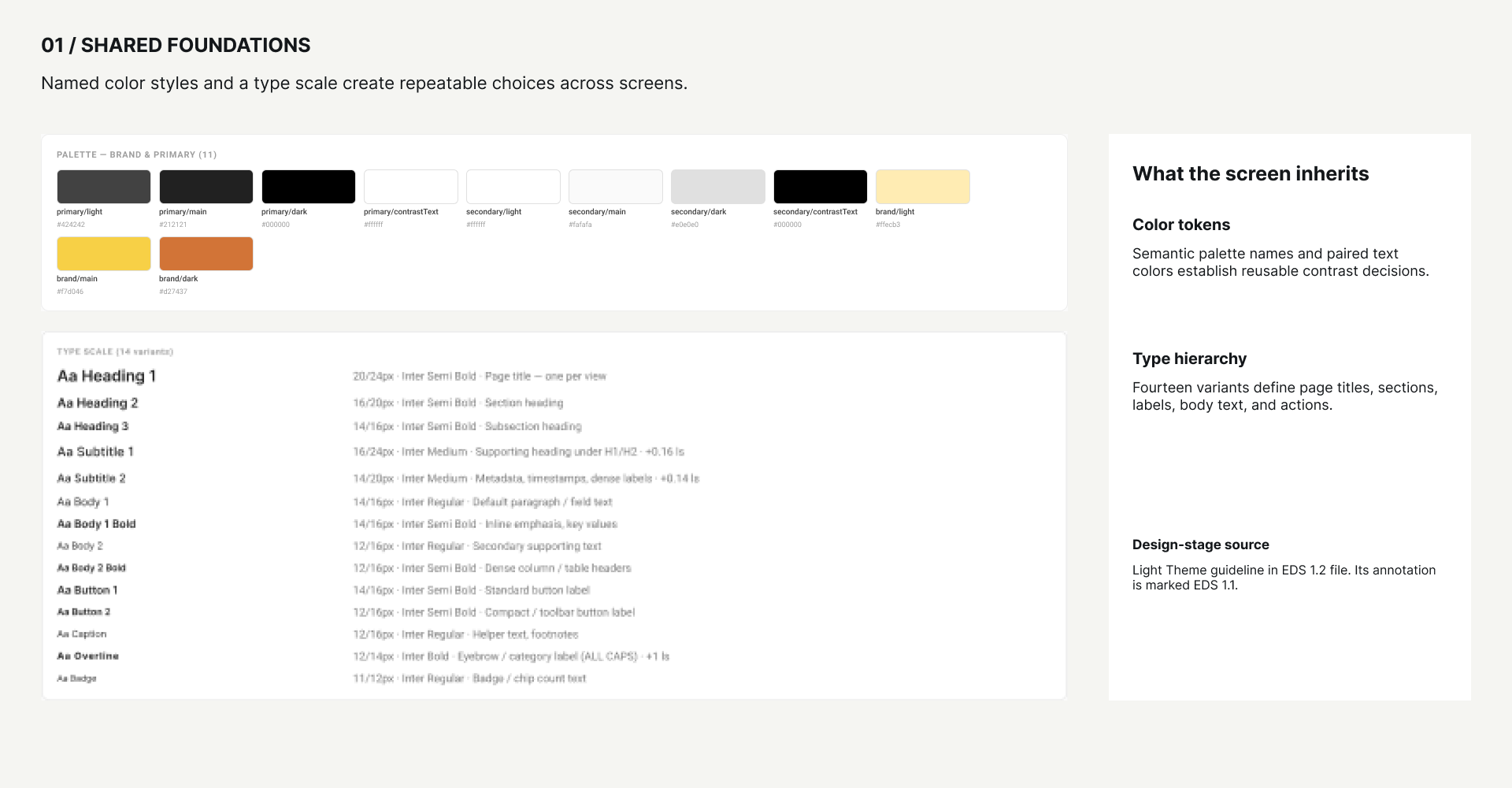
Make visual choices reusable
I needed teams to choose a named color and type style instead of matching a screenshot or hardcoding a value. The foundation defined semantic palette choices and a 14-variant type scale. It also made contrast a decision about foreground and background together, which gave accessibility reviews a more useful starting point.
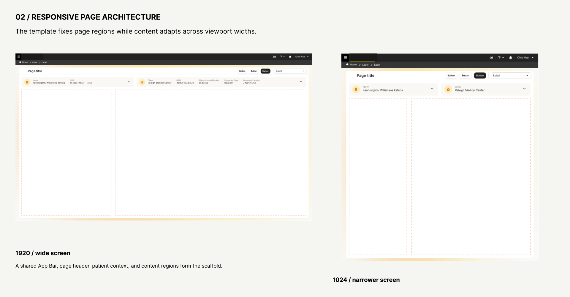
Give full pages a shared structure
A field or button library could not settle where navigation, patient context, page actions, and scrollable work belonged. The page templates defined that scaffold at wide and narrower widths. This made the Order Entry composition a use of common regions rather than a one-off assembly of controls.
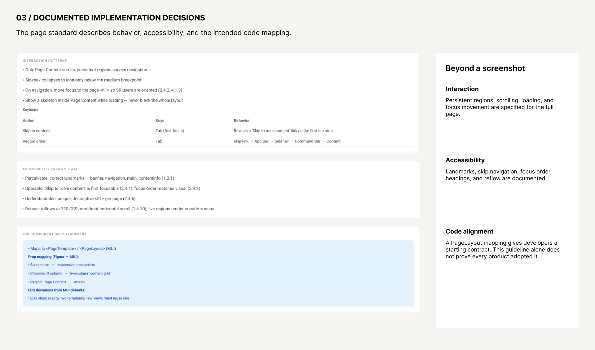
Specify the behavior a screen cannot show
The page guideline describes which regions persist, what scrolls, how focus moves on navigation, where loading appears, and how landmarks and skip navigation should work. It also records the intended PageLayout mapping for developers. That is the bridge from a design frame to a buildable standard; the later Storybook and Code Connect counts show reference coverage, while product checks remain necessary to confirm use.
Together these artifacts explain why the work was larger than a component library. Release records and project records support the separate claims about delivery and reach; the images show the decisions and design intent.
Guidance became part of the delivery path
Every component needed more than a set of variants. Written guidelines covered purpose, states, keyboard interaction, Web Content Accessibility Guidelines (WCAG) expectations, content, tokens, and implementation examples. Storybook exposed coded examples alongside links to the relevant Figma component and guideline. The Code Connect TSX and token JSON files gave developers another route from design definition to implementation.
That documentation served different decisions across the organization. Requirements engineers could specify a component's required behavior and states. Software engineers could inspect token names, props, coded examples, and migration guidance. Quality engineers could use the same keyboard, error, focus, and accessibility rules as acceptance criteria. We built a components-and-guidelines agent so those groups could ask questions against the published material and follow its source references.
The same sources changed UED’s first design pass. From a single product requirements document, the agent could propose an end-to-end workflow and initial screens grounded in EDS components and patterns. We then refined the sequence, content, and screen composition manually and through further agent prompts, checking the result against client needs and product constraints. Based on my observation of that initial design work, I estimate the first design phase became about 65% shorter. This estimate covers the initial workflow and screen proposal, not the full development or product release cycle.
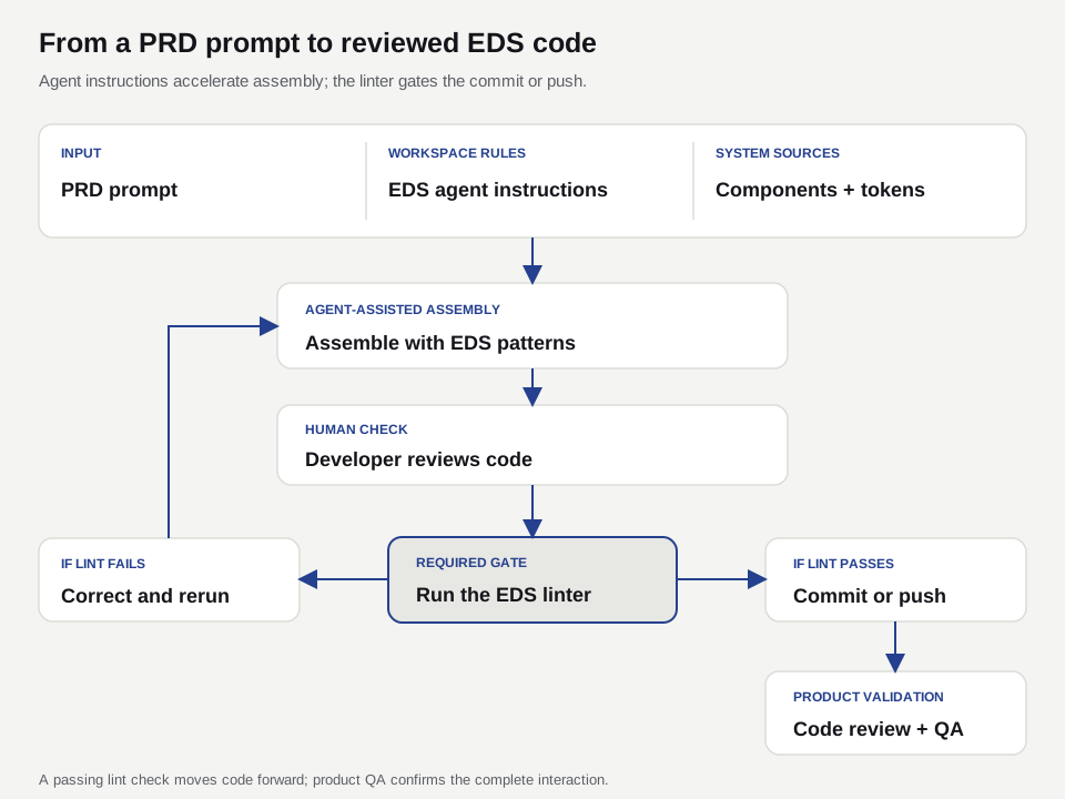
The agent answers against a compiled knowledge bundle of the published guidance and points readers back to its sources. The bundle requires a fresh compilation when guidance changes; the available record does not establish an automatic sync. Storybook provides coded examples, while the linter, developer review, and product QA check implementation at their respective stages. These controls create a repeatable path from a rule to software. The project evidence here establishes the coded reference and operating process; it does not document a named component's QA result in a particular shipped product.
Agent-assisted implementation still passes a code gate
Developers can give their workspace agent a product requirements document (PRD) as the prompt for assembling a page. Scoped instructions direct it to the EDS components, tokens, written guidelines, and coded examples. The developer inspects and corrects the result. The EDS linter is required before a commit or branch push, so violations can be corrected while the work is still local. Review and quality testing then check behavior that static rules cannot settle in a complete product flow.
The audit showed improvement and a continuing validation boundary
We used a common guideline template for purpose, variants, states, content, accessibility, keyboard behavior, and implementation expectations. AI helped draft some material, but a person reviewed it before publication. We released 96 component and pattern guidelines in total. The shared structure made missing decisions easier to spot and supplied the components-and-guidelines agent with a more consistent source.
Storybook supplied coded component and pattern examples. Its exact story and group counts need a fresh inventory because the project summary and later sidebar audit used different counting scopes. The July 15, 2026 Code Connect snapshot recorded 177 mappings across 70 files; 172 resolved to live Figma nodes. These counts describe reference coverage, not correct use in every product. A comparison of the Text Field guideline and Storybook required-field example found an open difference: the guideline specifies "(Required)" while the coded example showed an asterisk. The project evidence here does not show its resolution or release, so this remains an open handoff check.
The matched 40-pair contrast comparison appears in the table above. A broader static audit examined 597 variants and 2,919 candidate color pairs and flagged 515 instances, including 310 classified as actionable. Some candidate foreground and background colors never overlap in actual component or page use, so the raw flags require usage-aware triage before they can be treated as a final count of applicable failures. That audit has a different denominator and should not be graphed as the next point in the 40-pair series. An initial implementation guide documented seven contrast fixes without new failures in that release. The audit records distinguish candidate flags, actionable findings, and release-specific fixes; a final usage-aware re-audit remains a separate verification step.
After the initial recovery, a focused quality release addressed palette, contrast, typography, data-grid, and notification issues. EDS 1.2 was formally released on August 28, 2026 and is in use. It expanded components, guidance, and Storybook coverage and established the semantic foundation for a future dark mode. A complete dark mode had not shipped at this point. Release and adoption do not by themselves certify accessibility across every component and product workflow. The available audits establish the matched contrast improvement and the scope of the broader findings. They do not include a complete post-1.2 re-audit, independently checked keyboard and screen-reader results, or product-level sign-off for all teams. Those checks, plus resolution of the Text Field discrepancy, are needed to establish whether any accessibility gaps remain.
Sixteen of 22 teams use EDS 1.2
The system became the recognized source of truth for the primary application and supporting products, including new development and legacy-to-React modernization. Project records place 22 product teams or pods and more than 200 developers, requirements engineers, and quality engineers within its reach. As of October 4, 16 teams use EDS 1.2, or about 73% of the 22-team population. The remaining six have migration work in their backlogs, constrained by application release timing, contractual commitments, and legacy Kendo-to-React conversion. This is a version-specific adoption measure, not evidence that all 22 teams have completed migration. The matched design audits show how density and contrast changed in the shared assets. We have not established a comparable before-and-after measure for delivery cycle time or product defects attributable to EDS.
The harder part was making the system usable when a team had a deadline. Shared tokens, coded examples, migration notes, and exception support mattered. The release sequence showed that teams also need this information before they commit to an application plan. We now treat design success as a planning and verification responsibility that continues after a component is published. Requirements engineering, development, quality engineering, and UED all had to incorporate the new guidance, agent, lint, and validation steps into their existing work. The adoption count is a point-in-time measure; cross-organization reviews and exceptions continue to refine the practices as more teams complete migration. The required pre-commit or pre-push EDS linter brings configured violations into the developer's workflow. Workspace agent instructions can assemble a page from a PRD using EDS sources, and developer review and product QA check the resulting behavior. This is an AI-enabled implementation and DesignOps process, with human ownership of decisions and verification rather than a measured claim of faster delivery.